Seedland
A collection of wayfinding & signage projects done for a property developer client in China
Over the course of one and a half years, my team and I helped to develop the branding & wayfinding designs across multiple Seedland properties and developments across China. The projects shown are an example of some that I have worked on.
The Begonia Valley logo and signage are inspired by ocean plankton, its unique and irregular appearance conveys a sense of intrigue and scientific curiosity.
Outdoor signage was crafted with modular elements in mind, allowing users to craft their signage based on the various spatial needs.
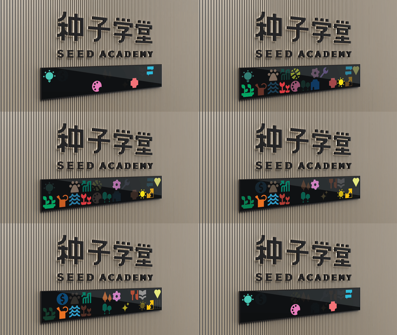
Seed Academy is part of a suite of services offered by Seedland - an enrichment centre for young and old alike to pick up new skills and enrol in classes.
Brightly coloured icons are used throughout the branding and signage to inject a sense of fun into the experience.
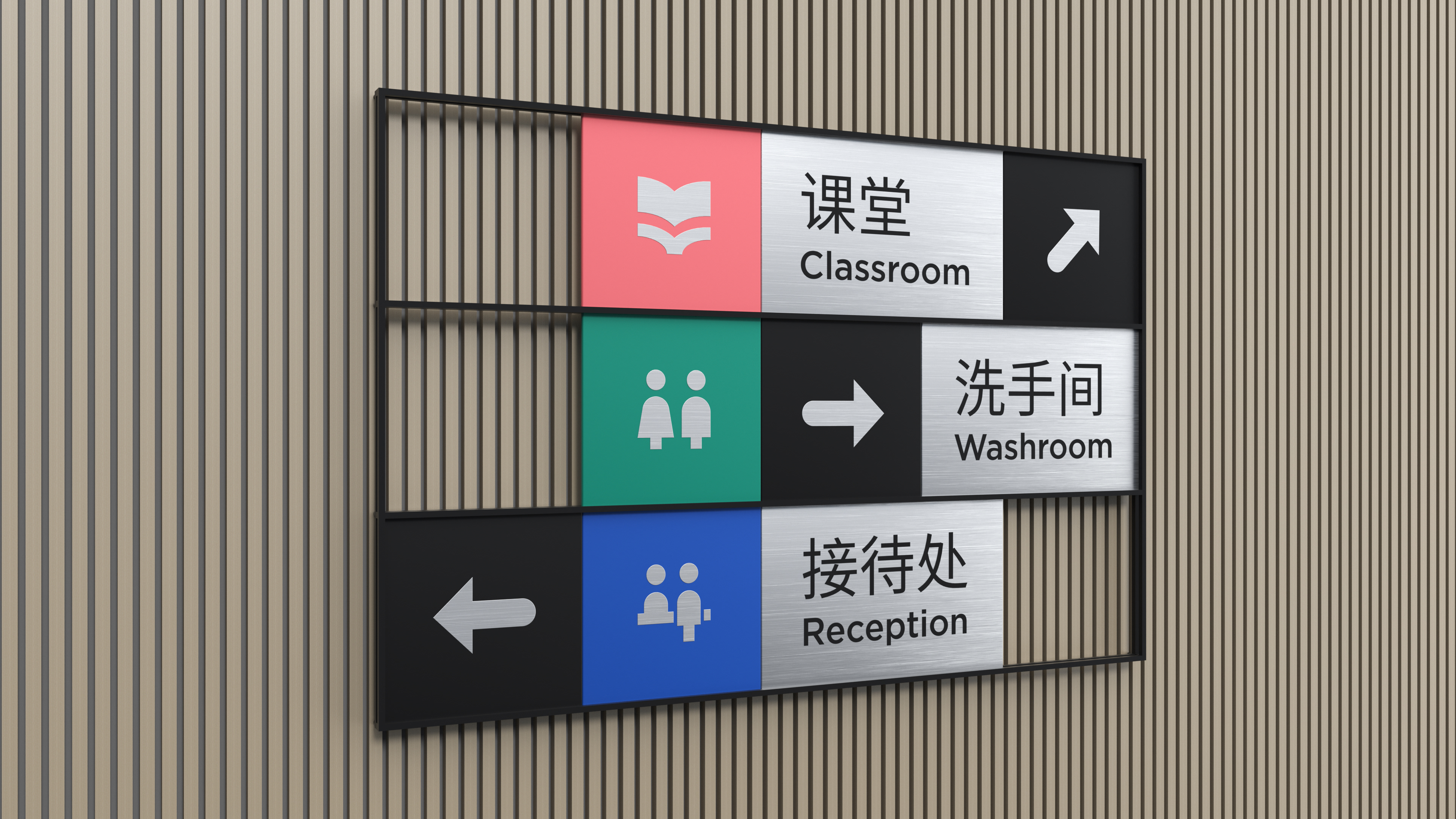
Physical directional signages resemble a jigsaw puzzle with pieces that are able to slide lengthwise to allow the signage to adapt to various needs.
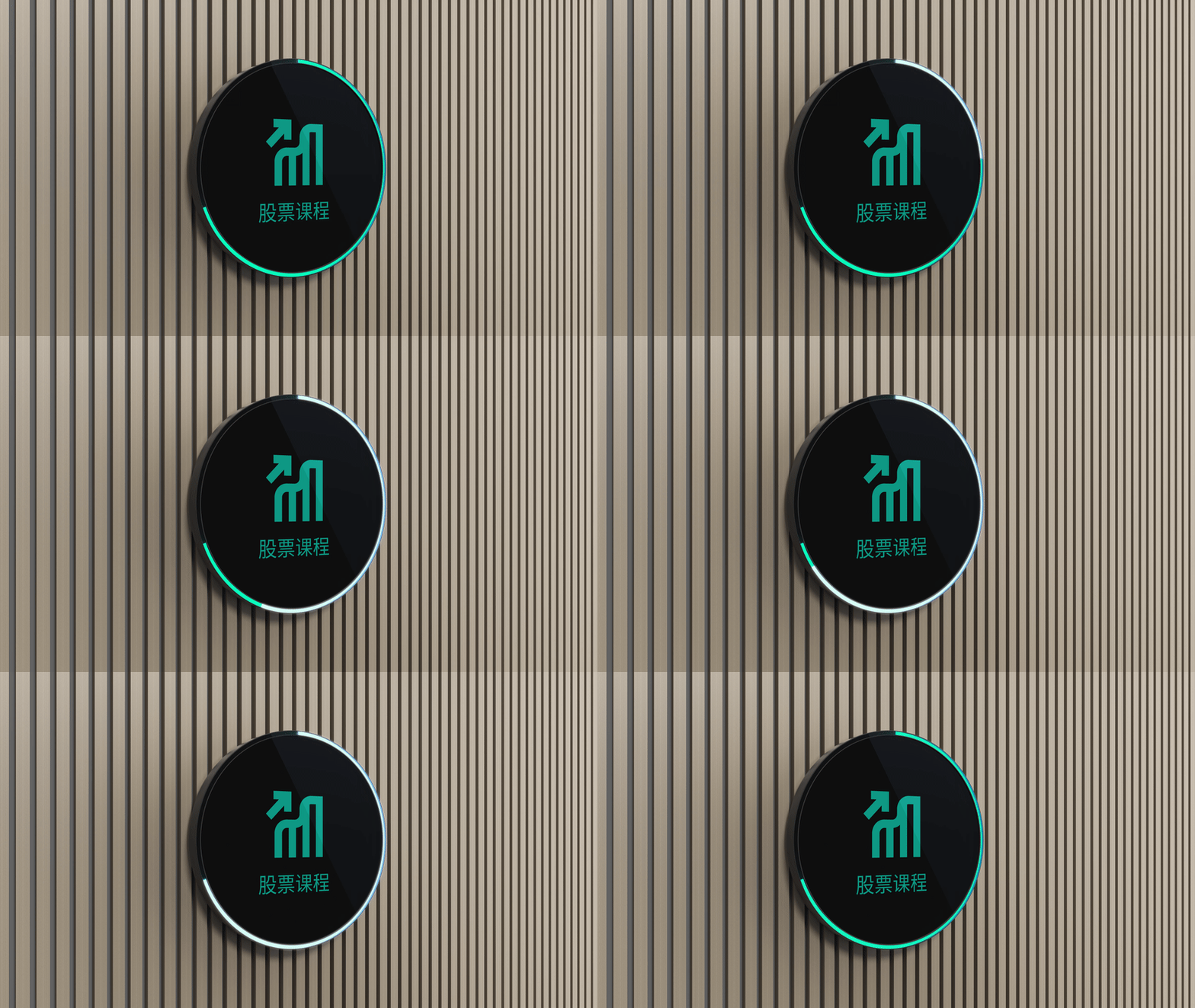
Room signages were also made digital, to indicate the ongoing classroom programme. The LED strip on the edge, indicates the time left before the class ends.
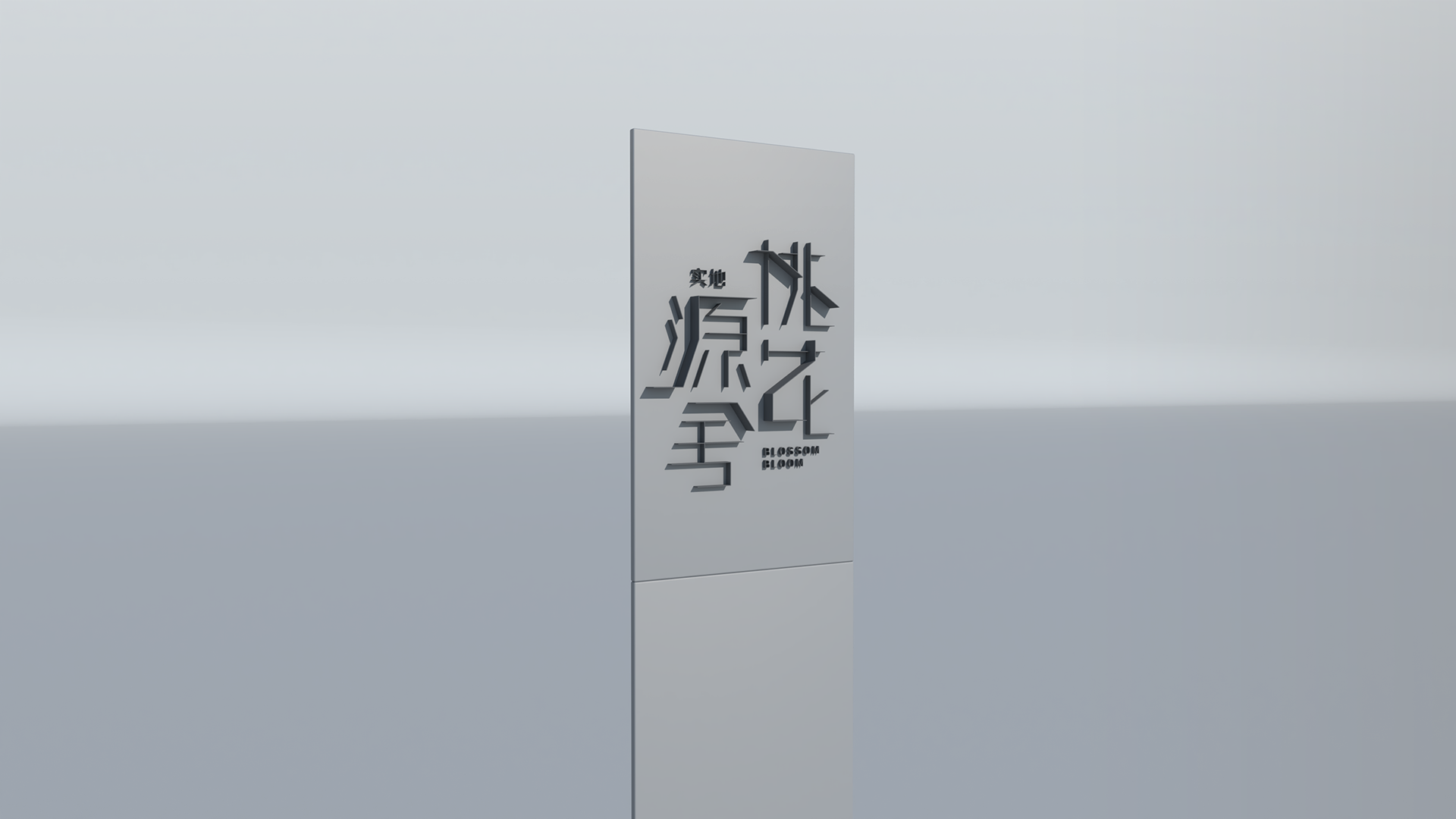
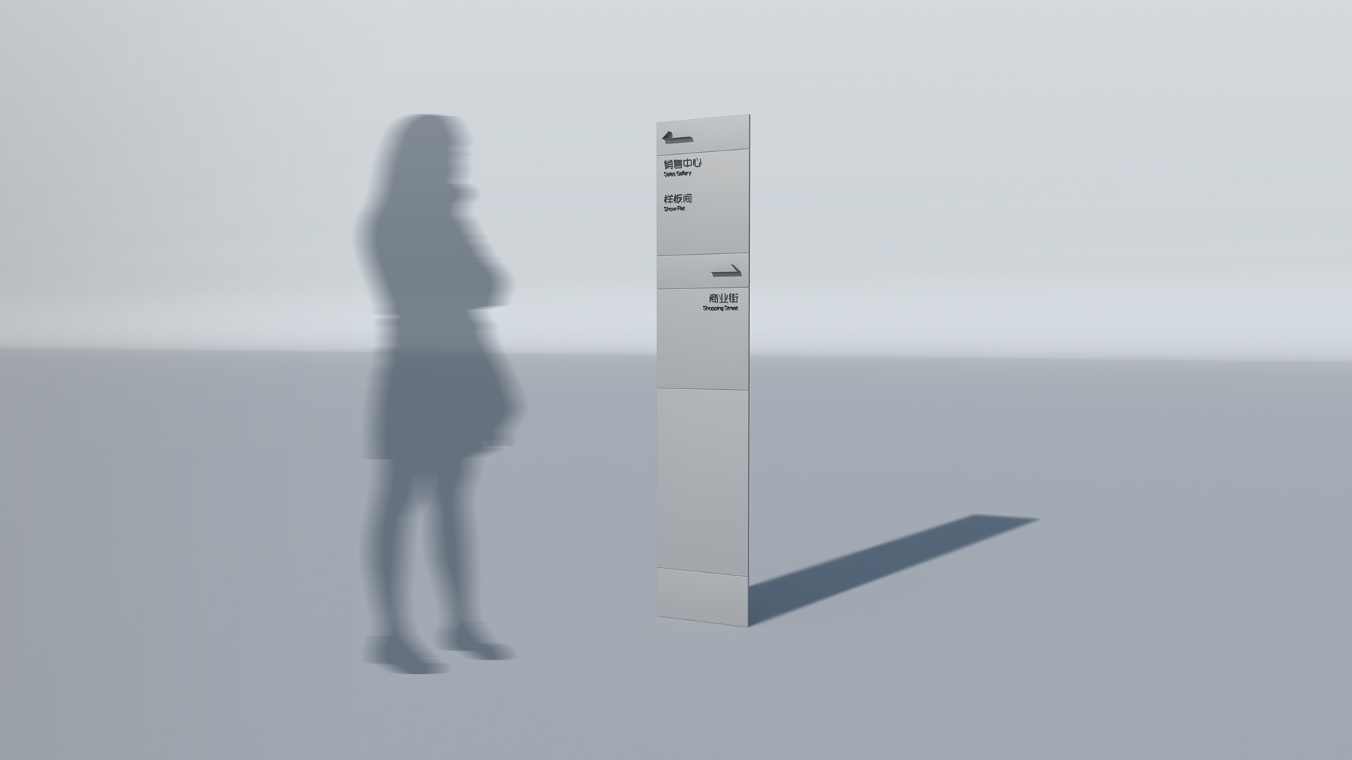
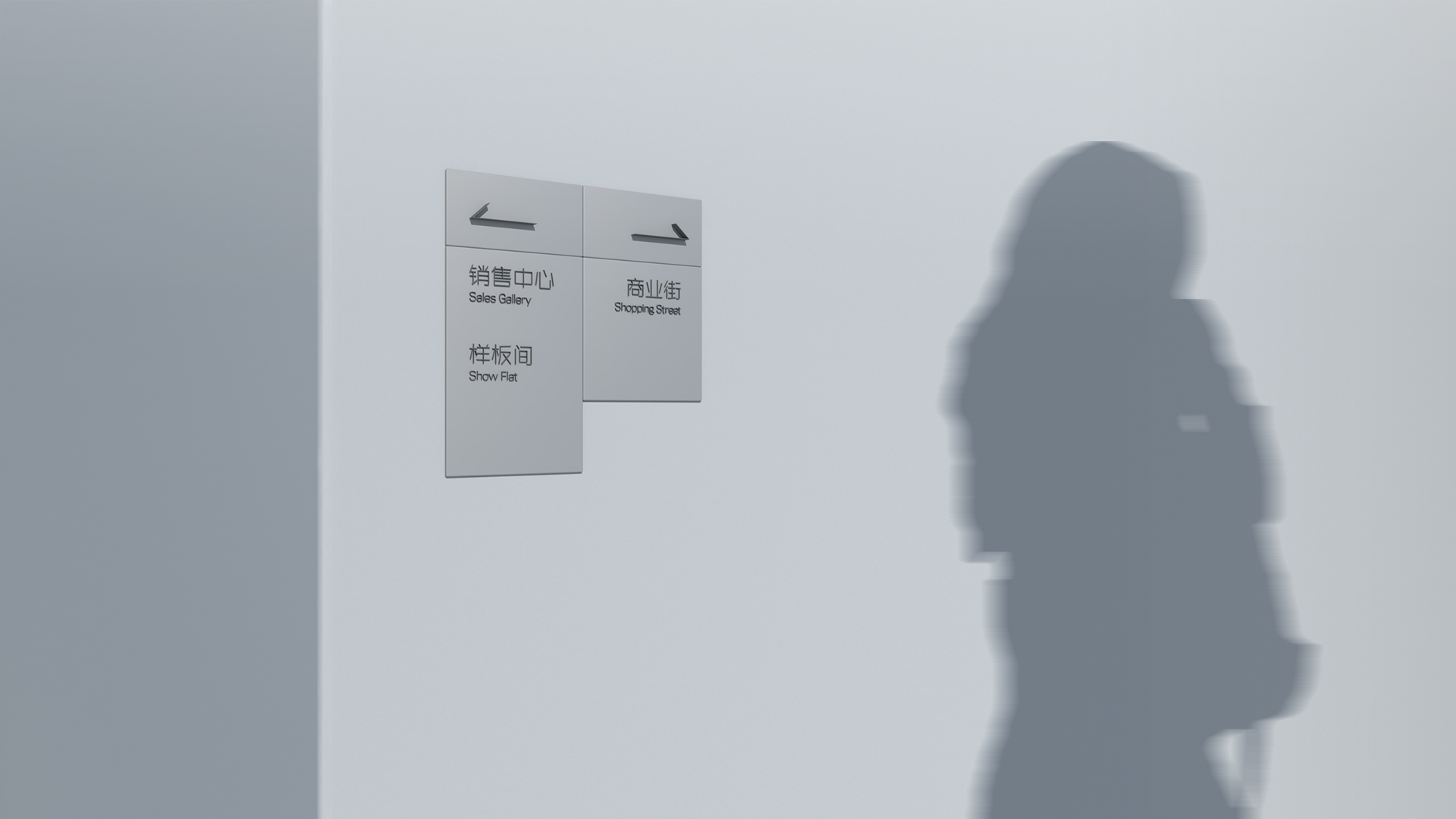
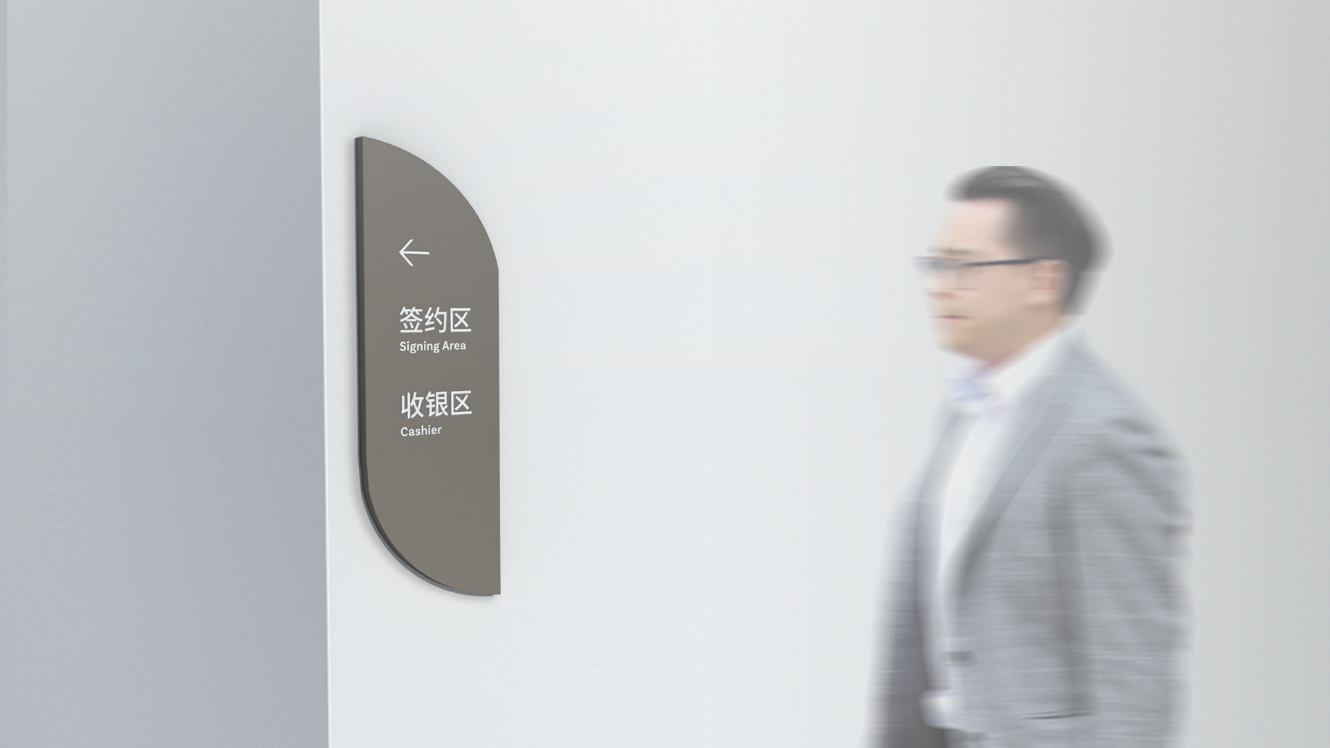
Inspired by the architecture of the Blossom Bloom development, which lent heavily on the use of shadows and pockets of light.
The outdoor and indoor signage design was centered around flat modular panels that could be stacked in various arrangements to alter its height, to allow for use in various scenarios.
The message and arrows were designed to be cut-out metal that extrudes perpendicularly from the face of the panel. The extrusion was designed in a way where it would be longer than standard metal cut-out text. This was done to create the effect of a shadow, which ties in well with the overall design language of light and shadows.
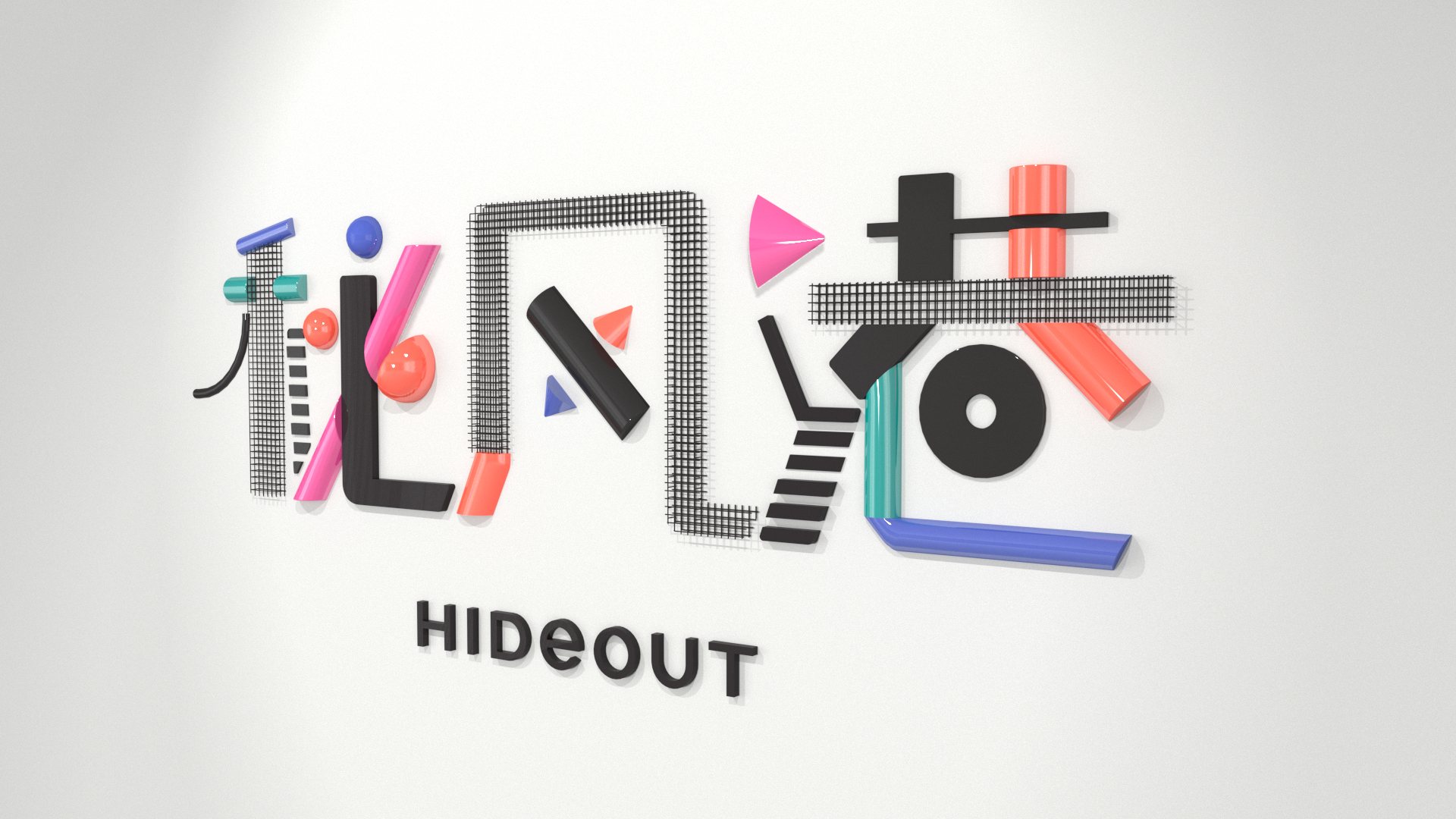


Hideout is a movie theatre that is under Seedland's suite of retail services that are available in some developments.
The main logo signage was inspired by the fun shapes and colours of the 2D graphic logo. The coloured portions were brought to life by making them three dimensional. Wire mesh was also used to give the signage texture and depth.
The projecting signs had the most interesting treatment. They were designed to represent a cone of projection typically associated with movie projectors. They were angled downwards to improve the visibility of the text and logos.
Client: Seedland
Branding and Logo Design: Xie Zong Ming, Sunny Tshih, Charmaine Wee, Neo Xin Yun
Signage Design: Patrick Khoo, Xie Zong Ming
Branding and Logo Design: Xie Zong Ming, Sunny Tshih, Charmaine Wee, Neo Xin Yun
Signage Design: Patrick Khoo, Xie Zong Ming